NEVS
DESIGN STRATEGY - BRAND IDENTITY - COMMUNICATION

In 2012, Saab Automobiles was acquired by bio energy industry pioneer Karl Johan Jiang, with a vision to focus on sustainable mobility through the production of premium electric vehicles. With the agency Grow, the branding process involved naming, design strategy, and crafting the visual identity for digital as well as physical applications. The design philosophy is based on the core idea: “Best for one. Best for all.”

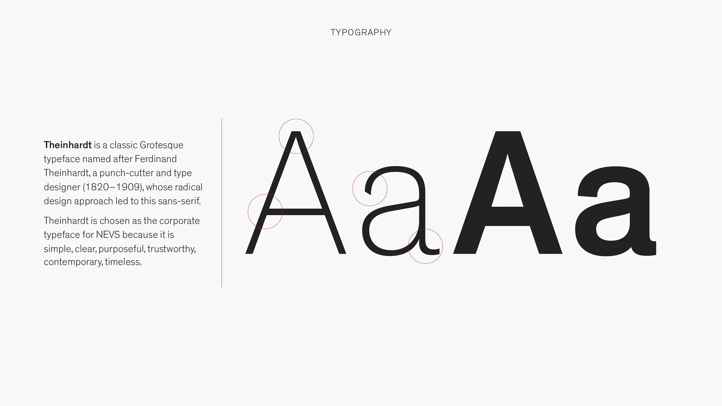
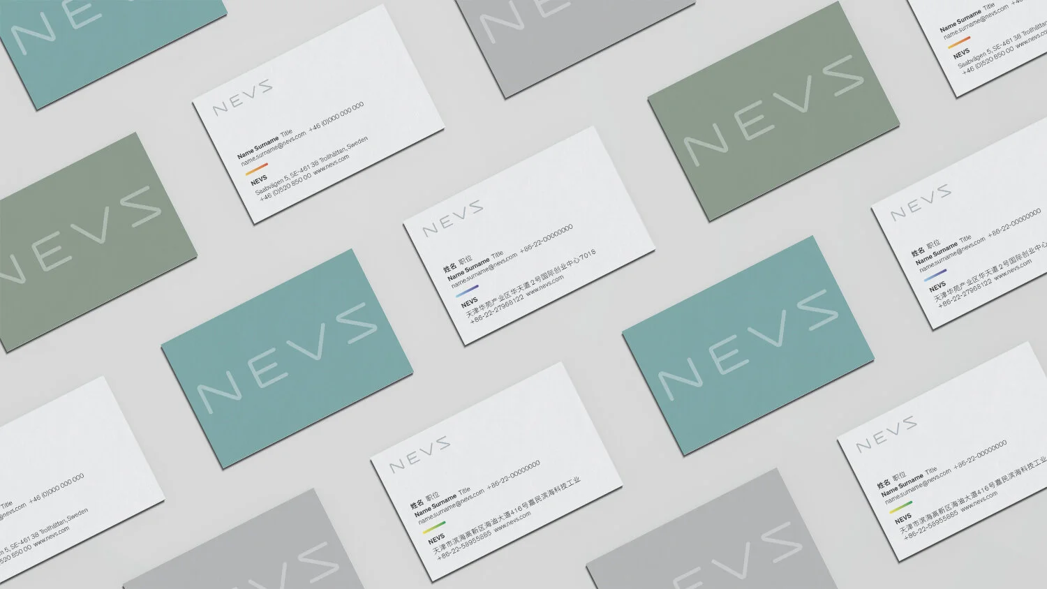
NEVS stands for National Electric Vehicle Sweden. The shape of the “N” and the “S” is derived from the symbol for alternating current (AC) – because the connection to electricity is at the heart of the business. Clean lines communicate seamlessness and transparency, and rounded edges convey an approachable, human touch.

The visual language balances references to both technology and nature. The core colour palette is inspired by colours found in Scandinavian nature – reflecting the cultural heritage of NEVS as well as its commitment to sustainability.

A key graphic element is the Electron, using gradients which represent electricity and energy. Its colours are inspired by the Northern Lights and the more vibrant hues found in nature.


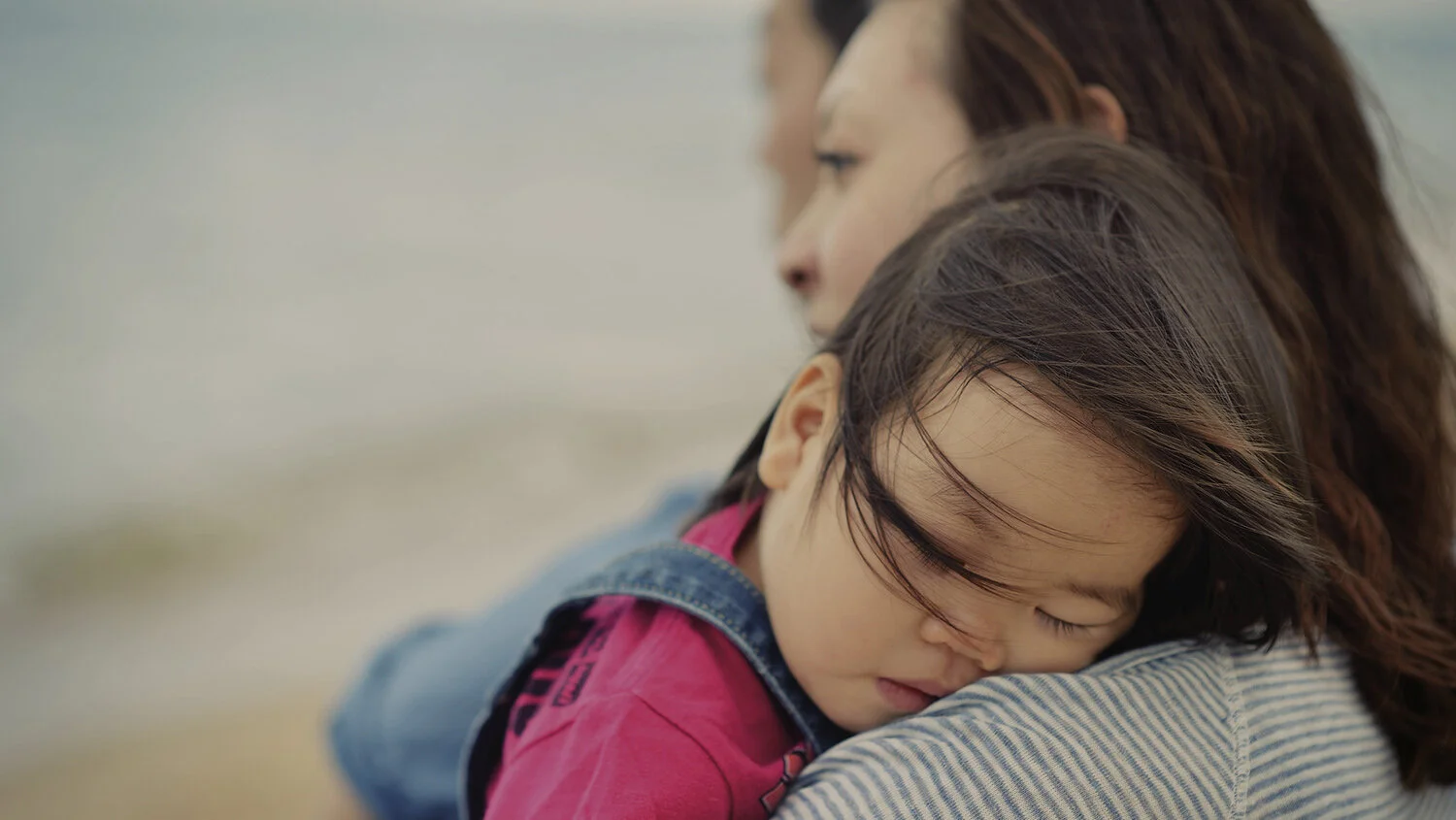
The NEVS image style is natural, warm, and authentically emotional. People are featured prominently, since humans are at the heart of all products and technological solutions.


The NEVS material universe is natural, sustainable, flexible, modular, warm, thoughtful, and brave. We created guidelines for the design of NEVS facilities – offices, events, exhibitions, and retail spaces – for environments that are both practical as well as inspiring.

Role: Art direction/Graphic design
Agency: Grow, Stockholm