Laponie of Scandinavia
BRAND IDENTITY - PACKAGING DESIGN - COMMUNICATION CONCEPT

Laponie is a skincare company which uses only the purest and most effective ingredients to make products for sensitive skin. The brand’s Scandinavian origins and values are central to its story: a no-nonsense approach, strong connection to nature and sustainability, commitment to authenticity, and the highest ethical standards.
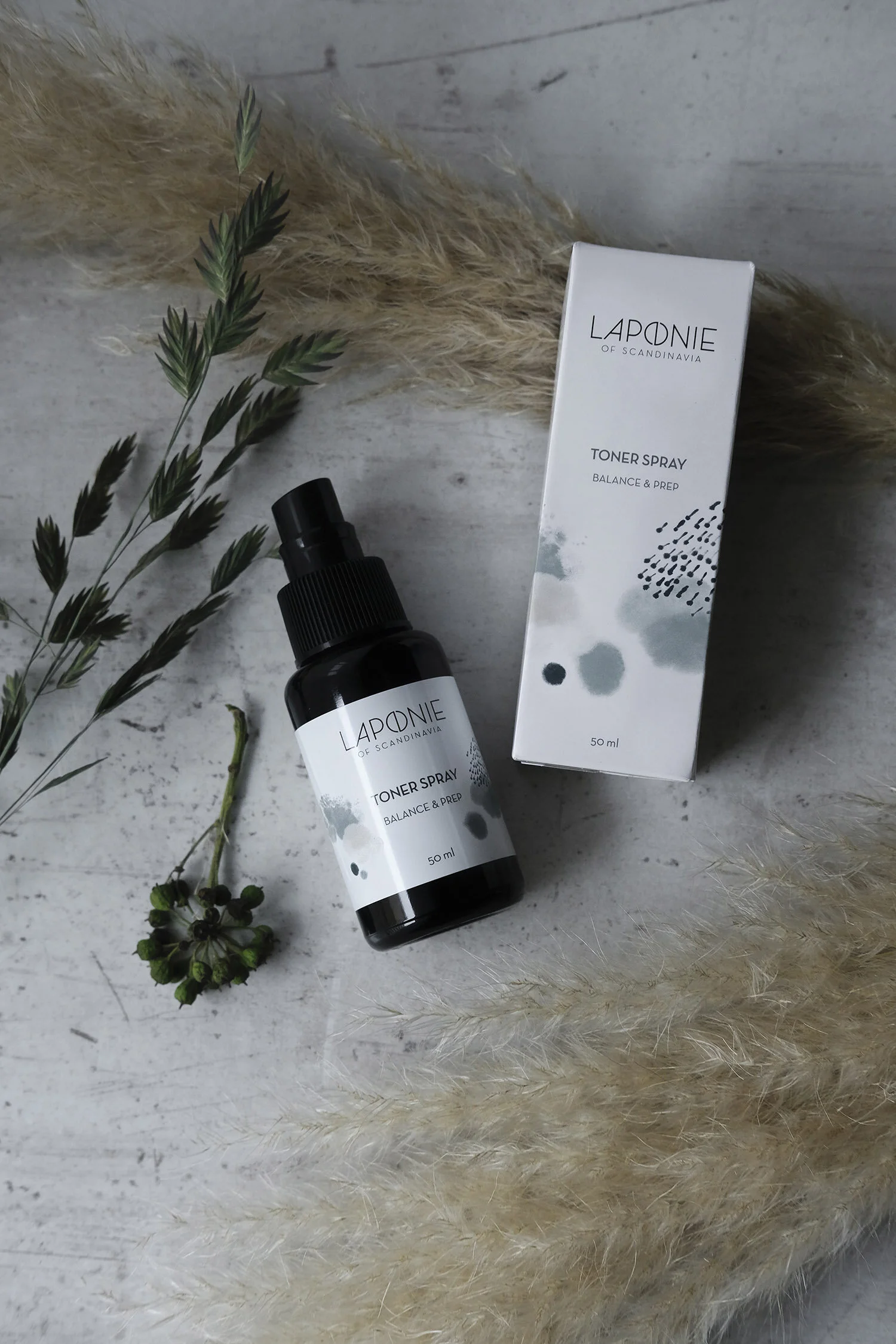
The Laponie "o" is inspired by a symbol used by the Sami, the indigenous people of Scandinavia. The original symbol, a circle with a line drawn vertically through the centre, represents the sun and the moon, balance, and the Sami world view of living in harmony with nature. These concepts are directly connected to the brand's commitment to purity, quality, health, and sustainability. A minimalistic approach to the ingredients as well as honesty and transparency are also key, hence the clean simplicity and directness in the overall look and feel of the logo.


Finnish illustrator Aino Maija Metsola was commissioned to create the uniquely abstract and emotional graphic elements. The shapes and textures are inspired by the landscapes of northern Finland, with a sense of imperfection, moodiness, and unpredictability – all characteristics of the Nordic climate. The illustrations also dramatise the brand concept of “skin days” – products designed to suit different skin conditions rather than skin types, recognising the fact that skin needs can vary from day to day, just like the weather.


Packaging is made from glass, aluminum, and paper, with a minimum of plastic. Ingredients are sourced as locally and sustainably as possible, and products are developed and manufactured in Finland and Sweden.


Role: Creative direction/Graphic design
Agency: Grow, Stockholm
Illustration: Aino Maija Metsola
Product photography: Maria Savola