Stockmann
BRAND STRATEGY - BRAND IDENTITY - COMMUNICATION

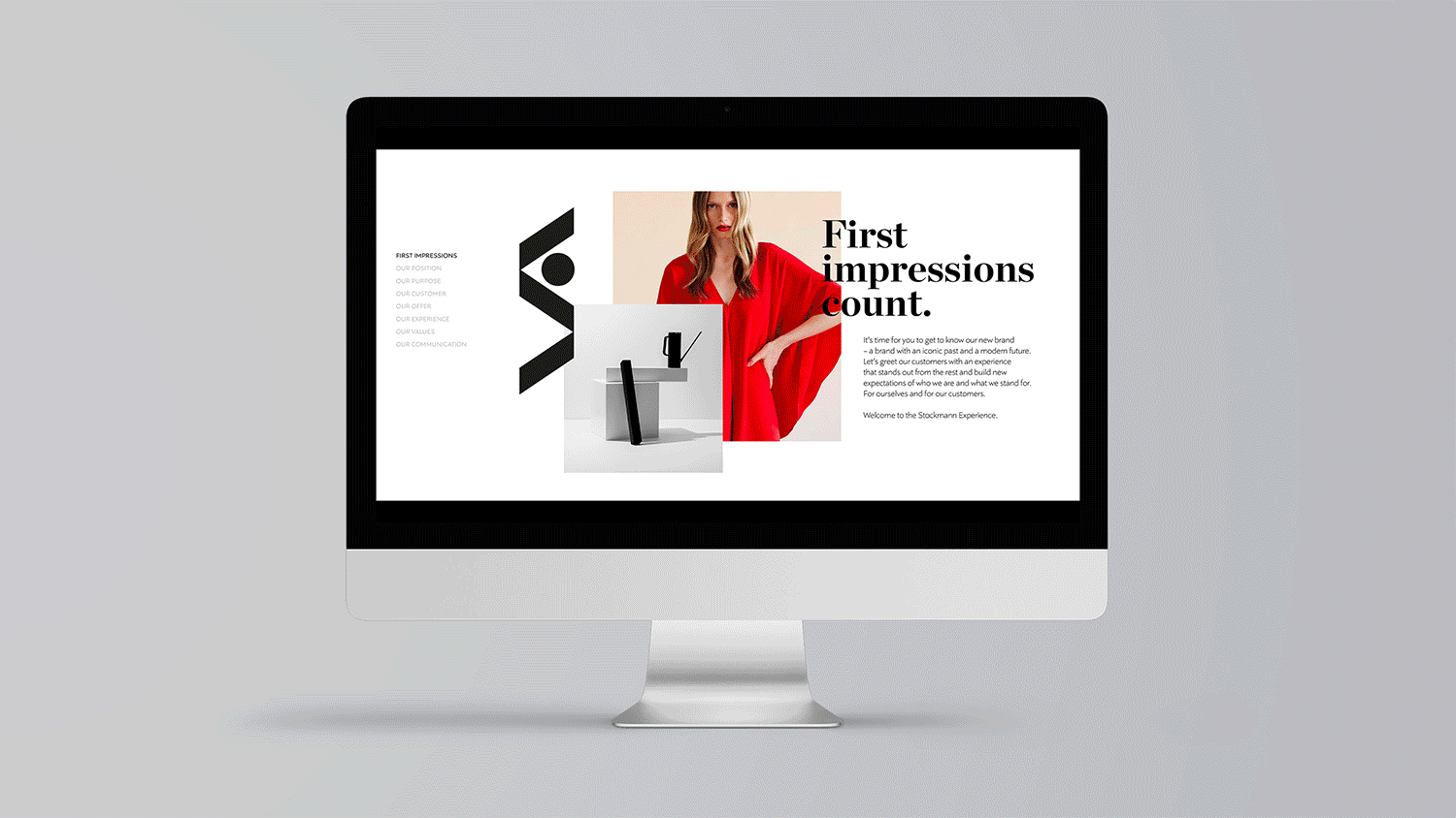
As Finland’s premium department store, Stockmann was in need of a brand refresh to bring back its relevance as an iconic establishment. This required a new brand platform and bold, confident creative direction across all touchpoints, both physical and digital.

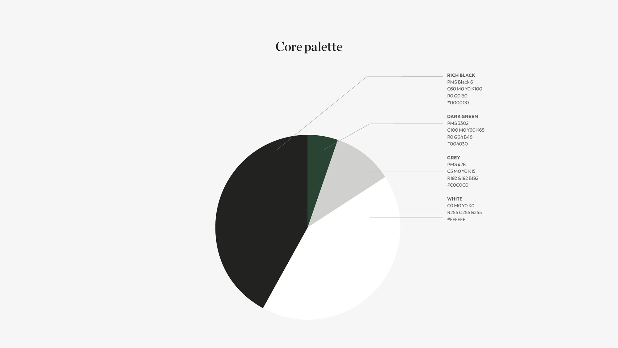
The “S” logo is a stylized representation of escalators. Its bold, graphic look and feel reflects the art deco movement, during which the iconic flagship store in Helsinki was built in 1930. Carrying such a long and rich cultural heritage, it was important to not only keep this existing part of Stockmann’s identity – but also celebrate it in an even more powerful way. In the refreshed identity, this logo becomes the key graphic element.

The shapes and angles of the logotype are elevated to become strong graphic identifiers – used dynamically, up close, cropped, filled. They become the building blocks for an iconic Stockmann visual universe, coming to life throughout the retail experience.


The imagery style was defined for all levels of communication – conceptual branding, commercial, and tactical sales.


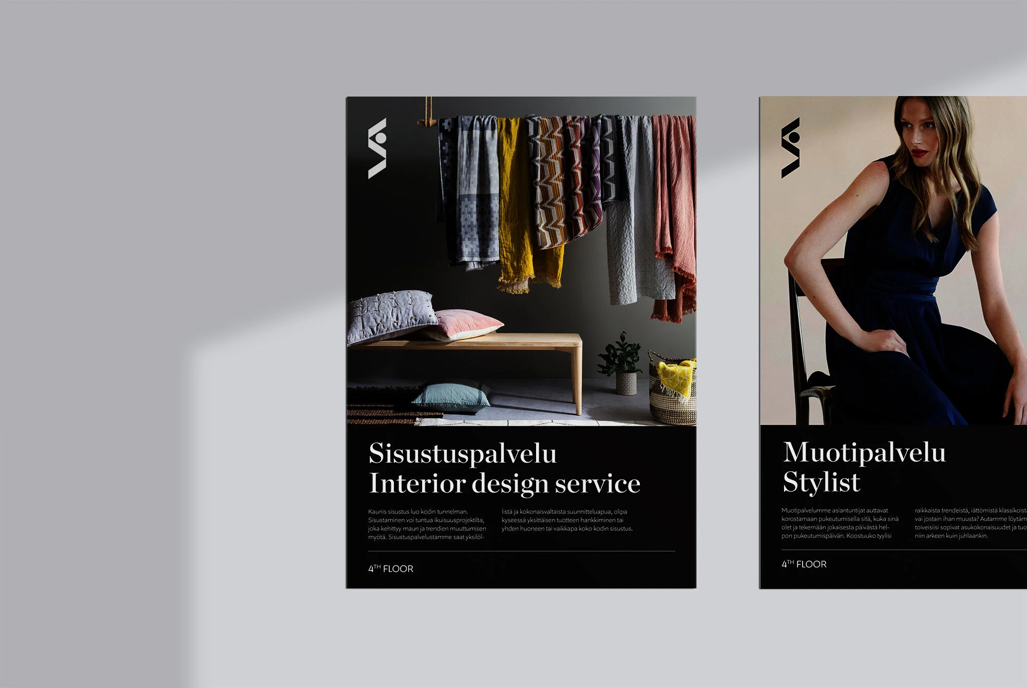


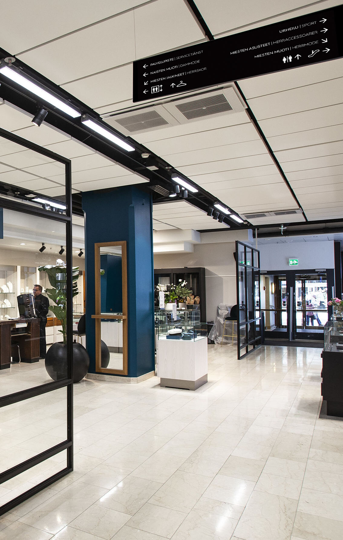
A full set of guidelines was delivered, with principles and specifications for the visual identity, advertising, visual merchandising, wayfinding, and signage. A digital brand book was also produced for internal use.
Role: Creative direction/Graphic design
Agency: Grow, Stockholm
Campaign imagery photgraphed & produced by John Brown Media
Point of sale still life images courtesy of Stockmann